Showing posts with label Modern Art. Show all posts

Monday, August 20, 2018

Chagall-inspired dream drawings

La Mariee, by Marc Chagall (1912)

I and the Village, by Marc Chagall (1911)

About the Artist: Marc Chagall (1887-1985), pronounced Sha-gall, was a modern artist on the forefront of surrealism in Europe in the early 20th century. (Surrealism is a style of art which attempted to express the workings of the subconscious mind, often creating images with really weird associations). Born in Belarus, he was Jewish and highly affected by the horrors to which the Jews were subjected to in the lead-up and during World War 2 in Europe. His works are characterized by a beautiful dreamlike quality, full of emotion.

Discussion Questions: Using the powerpoint presentation here, choose one Chagall painting (maybe the one that is most interesting to you) to discuss with the kids, letting the discussion be very open-ended - with the KIDS doing 90% of the talking. Remember, the goal with the discussion is to let the kids really look at the painting and connect with it, not to inundate them with facts they will soon forget. There are no wrong answers to any of the following questions. Encourage the kids to formulate their own opinions and then follow up, if applicable, with "what makes you say that?" so they have the opportunity to back it up.
  • What's going on in this painting? 
  • What makes you say that?
  • What more can you find?
  • What parts of the scene seem real, and what elements seem dream-like?
  • What emotions do you notice in the painting?
  • How does the color affect the mood, or feeling, of the painting?
Materials: (thickish, if possible) drawing paper, sharpies, markers. (You might want to put a mat/old manilla folder down under the paper, to protect each desk) 

Activity: (This activity is adapted from a great lesson found here. Thank you, Art Class Curator!) With a pencil, divide each paper with 2 diagonal lines to create 4 triangle sections on the paper. (I think I'll do this before the lesson for younger grades, but older kids could totally just do it). Have the kids start with one section, and draw a picture including animal(s), building(s) and people. It can get as weird as they want! After they fill one section, have them turn the paper and then fill in the next section. Each section will be a different direction, creating kind of the surreal-dream-like effect. When they are done drawing, have them color in with marker. Note: some kids will ask to make their drawing in pencil first. Don't let them! They'll NEVER finish in time! Hopefully their pictures will end up being so busy, any little mistakes they make won't even be noticeable to them. 

Examples: 


Wednesday, February 5, 2014

Rothko


MARK ROTHKO (1903-1970)
Untitled, Oil on Canvas
Pronounced: Roth-ko
Art Period: Modern, Abstract Expressionism
Activity: Pastel
Materials: watercolor paper, oil pastels, baby (or vegetable) oil, cotton balls or those spongy brushes, paper cups for the oil

Meet the artist: Rothko was born in Latvia, but moved to America with his family when he was 10. Considered one of America's most important artists, he is best known for the large color field paintings he did in his later career (which are part of a modern art movement called Abstract Expressionism). Rothko desired to express human emotions in his paintings, and used color as his primary tool. He layered "fields" (blocks) of color onto his canvases, which were very large, blurring the edges and creating division between the colors. The colors in some paintings vibrate against each other, creating tension; in others, the colors harmonize as the fields blend together.

Modern art can be difficult to understand for children (and adults). Rothko is a great introduction to modern abstraction as his goal is to simply have his viewers stand closely in front of his paintings and feel "enveloped within" - simply experiencing the effect of color, connecting their visual experience to their emotional experience. In the moment that connection is made, the art is understood.

Further information: National Gallery of Art article here (it's great - a short timeline with pictures); and the website of the Rothko Chapel - worth looking up to get a sense of how big Rothko's paintings are.

Discussion: Using the first image from the slideshow (link to slideshow here), ask the kids to try to connect one emotion with the painting they see (i.e., joy, excitement, peace, etc.), and share with the class. Go through all the slides doing the same. Then, going back to the first slide, explain Rothko's goal: "I'm interested in expressing basic human emotions" (quote from Rothko) and ask them how they think he tried to do that? Was he successful? Other questions to ask: can color effect how you feel, or is it just a tool to express how you feel? Also: notice that these paintings don't use many of the traditional elements of art - shape, line, or form. They rely wholly on color.

Rothko also provides a great opportunity to review the color wheel. You could ask the kids to point out in the paintings examples of opposite colors (red/green; blue/orange), or warm/cool colors.

Activity: Pass out the pastels and the paper. Have the kids unwrap the ones they'd like to use so they can use the sides of the pastels to create "fields" of color on their paper - starting with 3 different large colors. Encourage them to think deliberately about their color choices. After they've covered their papers (leaving a little border around the edges), have them use the sponge brush/cotton ball to cover their paper in oil (this will make the paper translucent, and also soften the pastels and make the texture more like paint). Then have them go back over the layers with more pastels, making the colors thicker and richer.

(*NOTE: THIS ACTIVITY COULD GO REALLY FAST FOR SOME KIDS SO ENCOURAGE LOTS OF THOUGHTFUL LAYERING. Otherwise - it's good for a day when you have a little less time!)

Student Work:


Thursday, January 2, 2014

Paul Klee and the Color Wheel


PAUL KLEE (1879-1940)
Southern Tunisian Gardens, 1919
Legend of the Nile, 1937
Pronounced: Kl-ee
Art Style: Expressionism
Art Terms: Primary Colors, Complementary Colors, Hot and Cool Colors
Art Activity: Painting
Materials:  small piece of watercolor paper (about 4" x 6"); Red, Yellow, Blue and Gold liquid watercolors (you just need a TINY amount of this kind of paint. We passed out little cups, with about a tablespoon of paint in each, and put one cup on each child's desk, with a paintbrush in it. The kids shared the colors with the kids sitting around them. Note that the paintbrushes stay with the paint, not with the child, as the cups move around so the colors don't get muddled); brushes (small are best with this lesson); little cups or bowls to hold the paint

Meet the Artist: Paul Klee (1879 - 1940), a swiss artist who painted in the 1900’s, loved color. He used color as a language, to create a sense of place in his pictures (the Tunisian watercolors) or of temperature (The Nile painting - the blue and white squares tell the story of a cool river - we know it's water looking at it, even though we don't see the shape of an ocean or stream). We can guess how he felt about what he painted by studying the colors he used. Here's a link to another brief article about Klee.

Discussion: Using the slideshow here, Focus first on the slide called Legend of the Nile (slide 4), and ask the discussion questions - (1) What do you see? (2) What makes you say that? and (3) What more can you find?

Paul Klee's paintings are great to use when teaching about color. Understanding color is super important as artists or designers. If you learn the language of color, you can use it to convey a feeling, provoke emotion, highlight certain details, or even to give your picture a temperature. What temperature do the kids think about when they look at the Nile painting? (cool). Now toggle to slide 7, Southern Tunisian Gardens. What temperature did the colors Klee used here make you feel? (hot).

Look at the pictures at the beginning of the slide show that reference the color wheel, and explain (or review) the following concepts: 

-Three colors - called primary colors - are the basis for the color wheel. These three colors can be mixed together (along with black and white) to create pretty much any color you can think of. RED, YELLOW, BLUE. (If there are kids in the class who happen to have shirts on that are R, Y or B, it's kind of fun to have them come & stand in front of the class).
-When you put opposite colors against each other, it makes the other color POP (this is called a complementary color). (Again, you can call kids up based on the colors of their shirts to demonstrate - for instance, put a kid wearing an orange shirt back to back with a kid wearing a purple shirt)
-Warm colors are red, yellow, orange; Cool colors are blue, green, violet. Warm colors feel like they are moving forward, while cool colors tend to make things look further away. (Have the kids close their eyes and think of the coldest place they can think of - and then have them describe the colors they see in this place; likewise with a hot place. These kids were talking about how your lips turn blue when you get cold, and how volcanos spit out red fire.)

Activity: 1. Pass out paper, & have kids write name, teacher, and grade on the back. Then have them draw a grid. (Note: in the interest of time, you may want to guide the kids to make only about six lines total. Lots of lines make a more detailed painting - which is awesome - but it will take longer to finish). No one needs to worry about their lines being perfectly straight or even - imperfect is best with this project.
2. Have the kids take a second to think about what they want to say with their painting. Do they want to make a picture of a hot place? Or of someplace cold? Or of a place that's both of those things? Or make a picture that feels happy, or serious? Before they start to paint, do they want to add any shapes like Klee did (look at the Tunisian paintings to see the domed roofs, or the volcanos...). If they want, they can create a horizon line to separate the earth from the sky...
3. Let the kids go to town painting. Guide them to try and use different colors in every square so they play around with mixing the colors right on their paper. The liquid watercolors are so vivid that it's really interesting to see what you get when you layer them on top of each other, or the way the complementary colors really pop when you use them next to each other.
4. Enjoy the serendipity of what the kids end up creating!

Student Work:

(These were made in 2nd Grade)

Monday, December 30, 2013

Klimt: Tree of Life


GUSTAVE KLIMT (1862-1918)
The Tree of Life, 1905
Pronounced: Kl-imp-t
Art Style: Modern, Symbolism
Activity: painting 
Materials: materials: construction paper (brown or black), gold metallic paint, white tempera paint, black tempera paint, thick & thin paintbrushes, bowls for the paint

This lesson is based on a lesson found on Deep Space Sparkle, here.

Meet the Artist: Klimt was born in Vienna, Austria, in 1862. His father was an engraver and goldsmith, which had an obvious effect of Klimt's art throughout his career (he loved painting with gold). Klimt's childhood was spent in poverty.

Inspired by the gold of his childhood as well as ancient Egyptian and Byzantine art, Klimt created a lavish style of art that often incorporated personal symbols (he was part of an art movement called Symbolism). Look at slide 5 in the slideshow for details from the Tree of Life - see references to Egyptian art (the Osiris eyes... other symbols look a lot like hieroglyphics). Here is a brief article about Klimt. Interestingly, one of his paintings - Adele Bloch-Bauer 1 - sold in 2006 for $135 million which was the most a painting had EVER sold for up to that point.

Discussion: The slideshow Cheryl Collins put together is here - (please note that it also contains instructions for the kids on executing the project, as well as biographical details for Klimt). Using the discussion questions, show the kids slide 5 (a detail of The Tree of Life) and ask: (1) What do you see? (2) What makes you say that? (3) What more can you find?

You might want to deepen your discussion by talking about where you think he may have gotten some of his inspiration from (Egyptian art?) and identifying some of the symbols they see. Klimt also used repetition of symbols, shapes, and colors to create interesting designs in his art. What shapes and colors do you see? What is the effect of all of those swirls, visually? Is the woman a part of his design, or a subject in the painting? Or both?

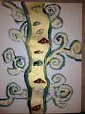
Activity: Start by painting the trunk and branches of the tree, with a thick brush, gold. Use fluid Klimt-like motions to create motion in the branches. Add details on the gold, with white paint. (Look at the Klimt painting for inspiration - eyes, symbols, designs, decorations...). Then outline the tree and the details in black. (Some kids chose to paint the entire background black which really makes the tree pop).

Student Work:


Wednesday, December 25, 2013

Kandinsky Circles (younger grades)


WASSILY KANDINSKY (1866-1944)
Squares with Concentric Circles, 1913
Pronounced: Can-Din-Skee
Art Style: Expressionism, Abstract Art
Art Terms: primary colors, complementary colors, abstract
Activity: Paper Collage or Pastel Work
Materials: black and colored construction paper (including enough pre-cut squares for each child to cut out 8 circles), scissors, glue; variation - black construction paper and oil or chalk pastels

(*this lesson is adapted from one on Deep Space Sparkle - original lesson here)

Powerpoint Presentation Here

Meet the Artist: A couple of brief articles about the Russian Kandinsky - considered by many to be the "Father of Abstract Art" here and here.

Discussion Ideas: As you look at Squares with Concentric Circles, ask the discussion questions: (1) What's going on in this picture? (2) What makes you say that? and (3) What more can you find?

Other ideas you may want to bring out in your discussion: (1) Kandinsky thought that colors and music were very much alike and that colors had sounds. For example, to him yellow sounded like a loud trumpet. What would this painting sound like? (2) Kandinsky was a pioneer of abstract art. Abstract means that the picture doesn't have a recognizable subject. What do you think is the subject of this painting? (3) Color: using the color wheel slide you can briefly explain the color wheel. Primary colors are red, blue, yellow. Kandinsky liked to play with colors, choosing combinations that were interesting to him. Opposite colors together (complementary colors) make the other one pop out more (red/green, blue/orange, violet/yellow). Sometimes it's fun to have kids wearing these colors come up and stand back to back. Have the kids point out combinations of color in Kandinsky's painting that demonstrate this.

Activity: Kandinsky once said, "everything starts with a dot." So do these projects.

Collage option: follow Deep Space Sparkle's instructions from the link on the top of this post. See example below.

Pastel option: Have the kids draw a horizontal and vertical line on their black construction paper, dividing their paper into 4 sections. Then have them choose a color and start in one section by making a large dot and coloring it in. Then, have them draw a circle around that dot, and in another color, color that in. Have them do it again until the section is all full of colored circles. Do the same in each section. You should not see much black construction paper when they are finished. Remind the kids to experiment with their color combinations!

Student Work:

(collage variation. I strongly recommend doing 4 instead of 6... it takes longer than you think!)

Tuesday, December 24, 2013

Matisse Cut-Outs


HENRI MATISSE (1869-1954)
La Gerbe, 1953
Pronounced: Ma-tees
Art Style: Modern
Art Terms: curvilinear, primary colors, complementary colors
Activity: Collage
Medium: Paper
Materials: construction paper, scissors, glue sticks

(*this lesson has been adapted with permission for use at GKE from a lesson by Michelle Smit, Duniway Elementary)

Slideshare presentation found here

Meet the Artist: (We have a Matisse Smart About Art book in the closet that you may want to read to the class, if time allows). Other great information to prepare yourself - this brief article here; also this link here is neat, with photographs of him, etc.

Discussion Ideas: Choosing one of the slides to focus on, begin with the discussion questions - (1) What's going on in this picture? (2) What makes you say that? (3) What more can you find?

Other ideas you may want to bring out: Matisse painted for most of his career, but when he grew old he got sick and was confined to his bed for a period of time. This is when he began to make cut-out pictures. He called making these cut-outs "painting with scissors." Notice how Matisse hasn't used so many straight lines in his cut-outs.  Another word for curved lines is curvilinear. Also his colors! Matisse felt like making art was an expression of joy and his colors in many of his paintings, and still, in his cut-outs - are bright and joyful. He used a lot of primary colors (red, blue, yellow - the colors that are the basis of the color wheel), and made those colors pop by putting the color's opposite (a complementary color) right next to a color (see the first slide, La Gerbe, notice the red/green; blue/orange...)

Activity: Have the students cut out a large rectangle or use a rectangular scrap in a contrasting color and have them glue it down to the middle of their paper. This will divide their background into three rectangular shapes creating a more interesting background. The colored stripe does not have to be exactly in the middle. The rectangle can be fat or thin. Their paper can be vertical or horizontal. They can use whatever color they want for the stripe. Then have the students use the scissors to cut out simple shapes with strong, bold colored construction paper. Cut out a variety of sizes from small to large. Suggest pasting down a small square or rectangle of another color behind their cutouts to create more depth. Remind them to use complimentary colors whenever possible. Use curvilinear shapes in addition to straight ones.
Once the students have enough shapes to fill up their 11x17-inch paper, have the students arrange their shapes on the paper BEFORE passing out the glue.
Have the students glue their shapes to their paper.

Tile Wall (Marker and Paper only) Variation: Have the kids look at their markers, and choose a color - then find its' complement (example: red/green; blue/orange; yellow/purple). Using these two colors, have the students create a few motifs with curvilinear shapes on scratch paper. (If they are stuck, flip back through the slideshow. Flowers, leaves, stars, birds are just a few ideas... you may want to draw some of these on the board.) Point out how those two colors make each other really pop, and suggest that they may want to use these two colors together in their final design. (But, whatever, I'd let them choose how they wanted to do it on their final paper as long as they kind of get the idea of complementary colors). On their final paper, have them draw their designs and color them in a way that makes them happy and "poppy." 

Student Work:


Georgia O'Keeffe (Simple)


GEORGIA O'KEEFFE (1887-1986)
Georgia O'Keeffe, Red Poppy VI, 1928
"When you take a flower in your hand and really look at it, it's your world for the moment.  I want to give that world to someone else." -Georgia O'Keefe

Pronounced: Oh-Keef
Medium: Painting
Materials: real flowers, sharpies, watercolors, watercolor paper, cups of water, brushes

Powerpoint: G. O'Keefe slideshow presentation is here.
Meet the Artist: Here is a link to a short biography of O'Keeffe. Another short article can be found here.

Discussion: Focusing on Poppies (1927) in the slideshow, ask the discussion questions: (1) What do you see? (2) What makes you say that? (3) What more can you find?

Ideas that you may want to bring out through the discussion, depending on the age of the students: (1) reference the quote below the picture at the top of this lesson. How does looking at something closely make it yours for a moment? (2) Georgia O'Keeffe's flower paintings were often quite large. How does her decision to paint a flower large and close-up make the painting feel? Imagine if it were small instead - how would that be different?

Activity: I brought in a jar of flowers, sharpies, watercolor paper, and a couple of colors of liquid watercolors (I find that with kindergarten simple is really important. At least for me!) Before we started drawing, I gave each child a flower to touch, examine and smell. We talked about the color, shape, and texture of the petals; the center of the flower; the stem; how and where the colors were different. After spending a minute or two noticing, the kids drew their flower shape with a sharpie, and then added color. My main drawing instruction was to go as big as they could with their flower so they had lots of room to show all the details they noticed. I thought the pictures turned out great. (*In Kindergarten, I don't do the whole class all at once. I'm at one of the stations and they rotate through. We were able to complete this project in our allotted 15 minute time but older children should be able to do more detailed work with more time).

Tissue paper variation: (My favorite way of teaching this!) Supplies - watercolor paper, liquid starch (I bought a big bottle at WalMart in the laundry section for under $3), tissue paper cut into rectangles, scissors, shallow bowls, and sponge brushes. At the end of the discussion (above), ask the kids about the parts of the flowers they notice - the stamen, the petals, the stem. Talk about the different shapes that different kind of petals have. It might be useful to bring in a few different kind of flowers, if you have them on hand. Then have the kids use scissors to cut out lots of petal shapes, etc., from the tissue paper. Once their tissues are all cut, they can use the sponge brush to apply liquid starch to the watercolor paper (all over), and then place the tissue on the paper. Point out how nice it is to layer the tissue so the color has depth. Once the tissue is placed, they can do a final layer of starch to really seal the tissue on the paper. This was done by a second grader:


Tile Wall (Marker Only) Variation: Using the black marker or sharpie, have the kids draw a very large flower on their paper, then add color with the marker (see instructions for activity above about going BIG).

Student Work:


Calder (Younger Grades)


Alexander Calder (1898 - 1976)
Rouge Triumphant 1963

Pronounced: Call-dur
Art Style: Modern
Art Terms: Kinetic, Sculpture, primary colors
Activity: Draw
Materials: sharpies, paper, oil pastels

Powerpoint: Rachelle Smith made a great powerpoint, which can be found by clicking here. It contains biographical information about the artist as well as how-to for the project.

Meet the Artist: Here's a nice article that gives a brief summary of Calder's artistic life.

Discussion Ideas: Choosing one slide (Rouge Triumphant might be a good one?), begin with the discussion questions - (1) What's going on in this picture? (2) What makes you say that? (3) What more can you find? 

Additional ideas you may want to bring out:  (1) Calder's sculptures were called "kinetic." Kinetic is a word that means movement. Why do you think that word applies to Calder's art? (The movement of the metal is part of the art; part of what you are supposed to get when you look at the piece. How would seeing this sculpture when it was moving make it look different than when it is still?) (2) Calder often used primary colors. What are the primary colors? (red, blue, yellow). How do these colors make you feel?


Activity: For instructions, see original lesson here. (At the art show these looked awesome mounted on black paper). Rachelle's tips: have them use the sharpie to draw a line first, and then have them add shapes coming off of the main line. Then have them use primary colored oil pastels (yellow, blue, red) to fill in their shapes.

Student Work: